What's new
  • Due to active development, we've had to change the site cookie domain. If you're having any issues logging in, please try clearing your cookies for forum.planetofthevapes.co.uk and try again. Sorry for any inconvenience. The POTV Team

Requesting Website Review

Vapourtorium

Postman
Joined
Feb 26, 2013
Messages
50
So we've finally got the shop side of things sorted. Decided to keep our current website layout and the online shop side of things links to our Wordpress shop.
Personally I hate wordpress sites so that's why I've decided to set it up this way.

Anyhows I'd like to know what you all think about both sides of it, the site itself and the shop page. If you find it hard to navigate certain areas please let me know so I can improve it. I'm hoping to go for ease of use to avoid confusion.

Thanks,
Michael.

www.vtvape.co.uk
 
Hi Michael, nice simple site :2thumbsup:

Two things I noticed, you refer to a cartomiser tank as a "cartomiser" and a cartomiser as a "carto head" - might cause some confusion when people are browsing - especially if they are new to vaping, and not familiar with the terminology? Aside from that, easy enough to navigate around.

Hope this helps? Lee :D

Fantastic, I'll be sure to go through all the item descriptions and improve on them more.
Thanks for the review :3
 
Hiya,
I use Chrome at the moment. I'm probably a little bit more critical than Dexter.

Ok, so I'm going to focus on what I see mainly as being a negative.....
Fonts change throughout the site. The twitter feed is more readable to me.
The menu items at the top are in a different font size.
The sliders seem to jump an image when scrolling left / right or up / down.
The shop follows a very standard WP theme. You might want to try and get it like your main page.
Have you considered making the shop the main page, and adding the other detail to it. I guess you're looking to focus on selling here.
Consider NOT resizing some of the images because they become stretched.
In the shop, consider removing comments, archives and some of the Meta bits on the right. Add some categories too as your stock levels build up.

Anyway, just a couple of thoughts.
 
Thanks for the review. I'm looking into WP themes. One that did match up somewhat ended up being a problem as it wouldn't work with the eCommerce plugin. I'm still working on that, I'm not overly good with WP as it is so that'll require some playing around with on my part. I'll see what I can do. :)
I'm using Chrome too, the slider seems to work fine on the 2 computers I've used, I'll have to look into that to see if there's some kind of glitch. The images should only shift from right to left. I'll also check it's compatibility with other browsers.
As for the online shop, that's not our main focus as we have 2 shops set up in Cumbria, we have that up mostly because people have asked if they can order our stuff online when they're away or living in surrounding areas and can't make it to the towns as often. As I stated in the original post I dislike WP site layouts so that's why only the online store is located there.

Thanks again for the review I'll work with the fonts and layouts more as well as compatibility. Hopefully I can get the errors sorted :)
 
I agree with J on some of his bits.

I would make the shop the main focus, with the other bits being secondary. Conformity is a big thing, stick to one font for headings and a smaller font for descriptive bits.

The other thing that (and this comes strictly from dealing with vendors around the world on a daily basis) I personally feel the following information is MUST HAVE on any UK website

*No Under 18's in graphich form
*Nicotine Toxicity and Warning including a visual representation http://wiki.planetofthevapes.co.uk/wiki/Nicotine_Safety_Warning
*Business or Companies house Number to show registration as a company


Reduce the 2 contact forms, to one single one.


Have a look here for all the regulations and laws http://wiki.planetofthevapes.co.uk/wiki/Regulations_and_Laws_for_UK_Vendors
 
If your main focus is the People you sell to in person, they will all ready know about you and who you are, so making the shop the main bit would be a logical choice...
 
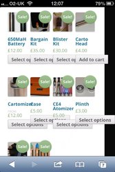
image.jpgJust a quick one. Do most of my shopping on Te mobile so have it a go. Seems some of the options boxes are out of line on grid view.

might be worth trying to see if you can set it to list view for mobiles? Not sure if that is possible?
 
As above plus.

a) Stating on the Home Page that e cigs a re a 'quit smoking' product goes against the ethos of the vaping market - its not an NRT it's an alternative
b) 'Single Liquid' - you don't seem to state just how much of the single liquid the customer is getting for £8.50

Hope this is helpful.
 
Yes deffo remove the quit smoking bit...once you start claiming its a quit smoking aid, you are delving into the realm of medicinal devices, and in all reality, if these go the medicine route, your website wont matter any more any ways, you will have to close up shop unless you dont sell nicotine base e-liquids...
 
Back
Top Bottom