Bryan123456
Achiever
- Joined
- Jul 17, 2012
- Messages
- 2,383
www.vapourjuice.co.uk

Where to start with this site? Firstly I have to say that I shop there and will be placing an order soon. Maybe I should belay that for a little while as they may want to give me the benefit of some added rat poison when they read this.
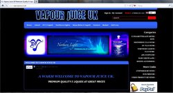
NAVIGATION
There’s a top horizontal menu bar that features
Home
About
DV E Liquid
Northern Lights
Moonshine E Liquid
Contact
Basket
Delivery
On the right hand side of the page is a vertical menu bar that’s headed ‘Categories’ and features:
Categories
E cigarettes and starter kits
Moonshine flavours
DV Flavours
Northern Lights Flavours
5ml samplers
Base Liquid 20 ml
Mixing Accessories
There’s another heading ‘Store Links’
Customer reviews
Our friends
Video reviews
This is followed by graphic links to PayPal and Facebook – which are self explanatory.
Gripes
First gripe – if Categories was replaced with Store – I’d know exactly what this was. It’s not self-explanatory.
Second gripe – some of the menu items spill over to two lines – something someone with a little knowledge of CSS could sort out simply.
Design
Design wise, this doesn’t cut the mustard. It’s a sort of “I met Darren in the pub. He was really good at art at school and designed some of his own tattoos. After we’d had a few – a lot actually, I asked him to design our site”. If this seems cruel, sorry, but it’s my perception
A web designer should assume that a visitor is a first time visitor and has no knowledge and make it easy to find what the visitor wants. This doesn’t.
Northern Lights and Moonshine pages describe the product benefits in brief and feature grey text on a black background – bad practice for everyone – inexcusable as an issue for the visually impaired. Small red text also appears against a black background and is similarly illegible.
Customer reviews appear as a purpley blue on black and text spacing kerning and leading is – inconsistent.
I could go on but feel mean – suffice to say that the web site does not do the products justice. It’s a bit like a dealership selling brand new BMWs from a rusty corrugated iron shed up a potholed mud track.
Product pages
The organisation of the product pages is much better – DV Flavours takes me to DV Beverages which takes me to the Doppio Espresso I like. The search facility get me there too – so at least I can find what I want.
When a user gets to the products, mercifully, the shopping cart system takes over and descriptions are good as generally is the photography.
Shopping.
The shopping cart system is tried and proven and works.
Overall
You can find what you want but first impressions aren’t up to the actual products. This vendor produces some great products but the web site is punching well below its weight and needs reviewing and redesigning.
It would be unfair to compare this site to Liberty Flights or they who shall not be named – vendors with substantial resources.
BUT www.vapistsvapours.co.uk is similar in size and uses the same cart system, yet manages to produce a cleaner, more logical and better looking site. And there’s the rub.
This is a personal review. I have received no payment or goods in lieu from any party to make this review. The opinions therein are my own and not those of www.planetofthevapes.co.uk who may or may not agree/disagree with any or all of my statements.
Last edited:


